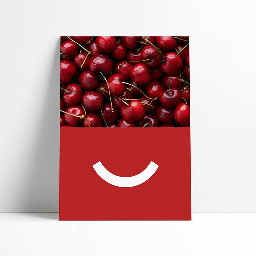
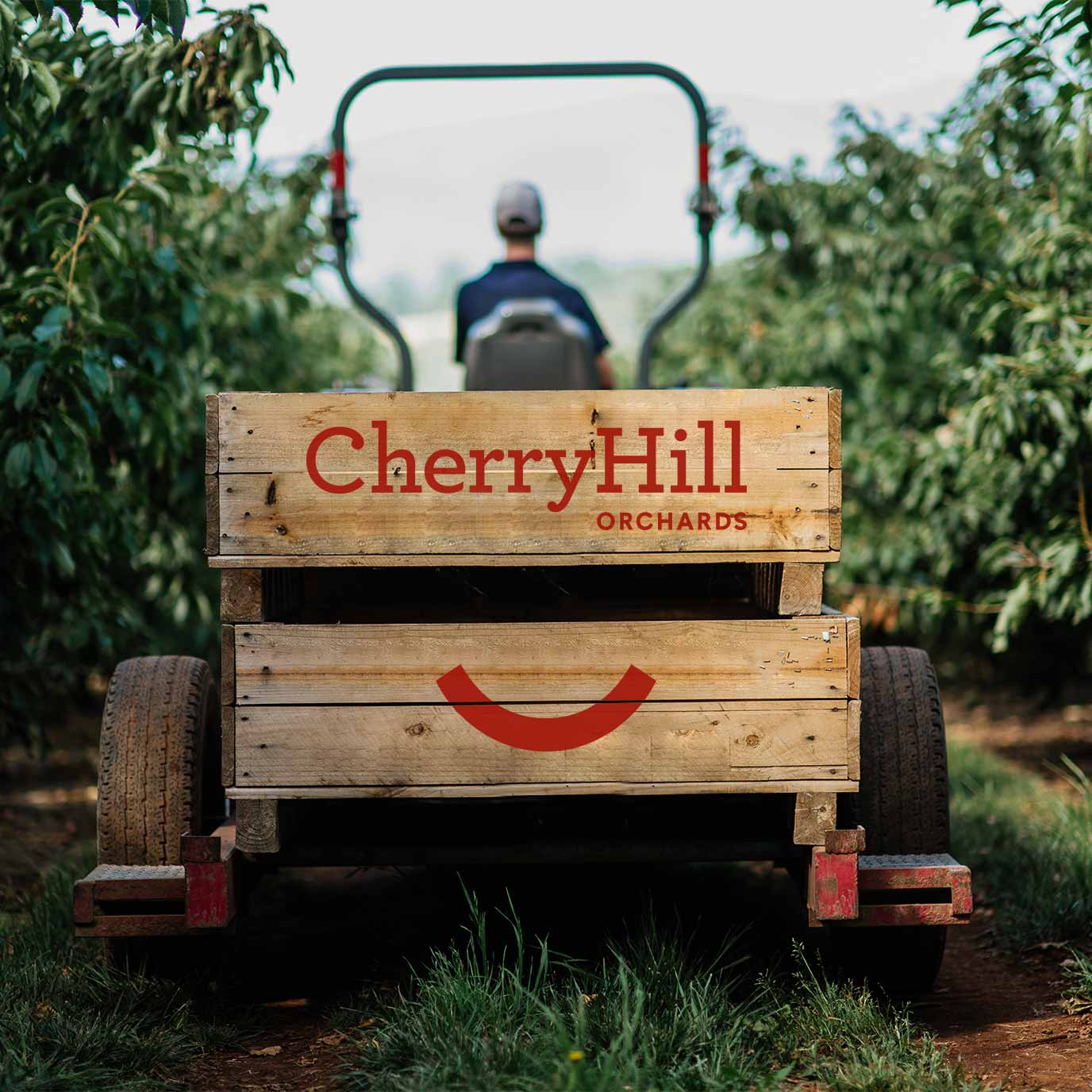
“The rebrand has been pretty amazing. Visually we love it. Everyone seems to be captivated by that smile. But it’s not just us, the feedback from retailers and customers has been incredible. We can feel the benefit. That smile is part of our culture now.”
REBRANDING AND PACKAGING DESIGN
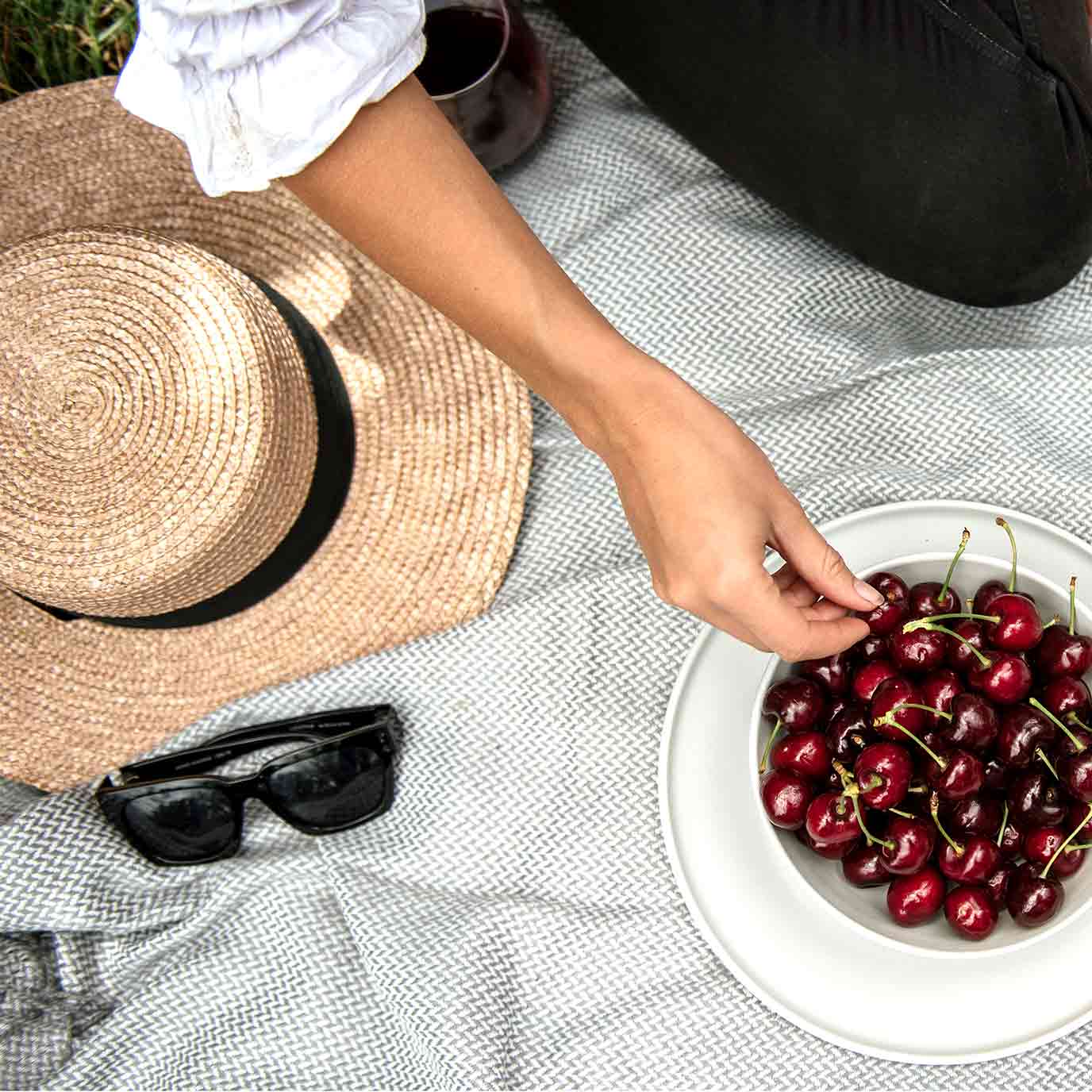
A strong and playful new brand for third generation, family business CherryHill Orchards is seeing success at home and abroad.