Packaging Inspiration – Health Beverages
Each month we get together as a team for ‘Creative Club’ and share inspiring branding ideas we’ve stumbled across, with one another. The topics vary, from most humorous ads, to the best rebrands and so on. More recently we spent our Creative Club time discussing brand packaging.
For so many businesses, packaging is a huge part of both their brand and their success. And because of this, it’s a large focus for Tiny Hunter too. We’ve worked on packaging design for an array of clientele and it’s always an exciting challenge. In the words of our very own senior designer Ara, the design requires a special skill because “it’s a 3D object that contributes to bringing a brand to life. It’s an experience, not just a design.” Your work has to translate from a flat image into something tangible. The ideas, icons and symbols you create need to work across all elements of the brand — not just their website or online content. Packaging is a whole different game.
So, on that note — we thought we’d share with you our special packaging selects in the category of… health food drinks.
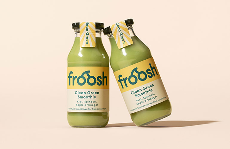
You don’t need a second look to figure out that this brand is happy and uplifting. That’s what the packaging communicates. From the font, to the colour palette and the cute little fruit icon stickers quality sealing their environmentally friendly glass bottles… you get the idea within seconds that this brand is healthy, natural, thoughtful and fun. The colours for each flavour represent the ingredients. And the simplicity of the tonal colour palette used helps to further establish their point of difference: no unnecessary additions. The ingredients are really JUST the fruit flavour they are. They go a step further too and have considered the actual material their label sits upon. Froosh is an environmentally conscious brand, offering “urban busy people a convenient way to get more fruit in their everyday life” and their package material reflects that too. They don’t use plastic, aluminium or anything that isn’t reusable or recyclable.
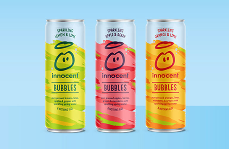
A UK based brand that’s not too dissimilar to our friends over at Froosh. Innocent make delicious healthy smoothies and drinks from all-natural ingredients. Again the brand message is evident through the packaging. The font and logo are playful and the colours are fun but not artificial, to represent their philosophy that things don’t have to have all the added sugar to be delicious. The original and most organic version is the best.
Their packaging material is also environmentally friendly, all are 100% recyclable and made from 50% ALREADY recycled materials. They have a range of sparkling fruit drinks that deviate slightly from the fruit juice only theme we see with Froosh. So the packaging for this product is a little more brightly coloured and textured, as their emphasis is slightly heavier on the YUM and FUN than the pure health ingredient focus at Froosh.
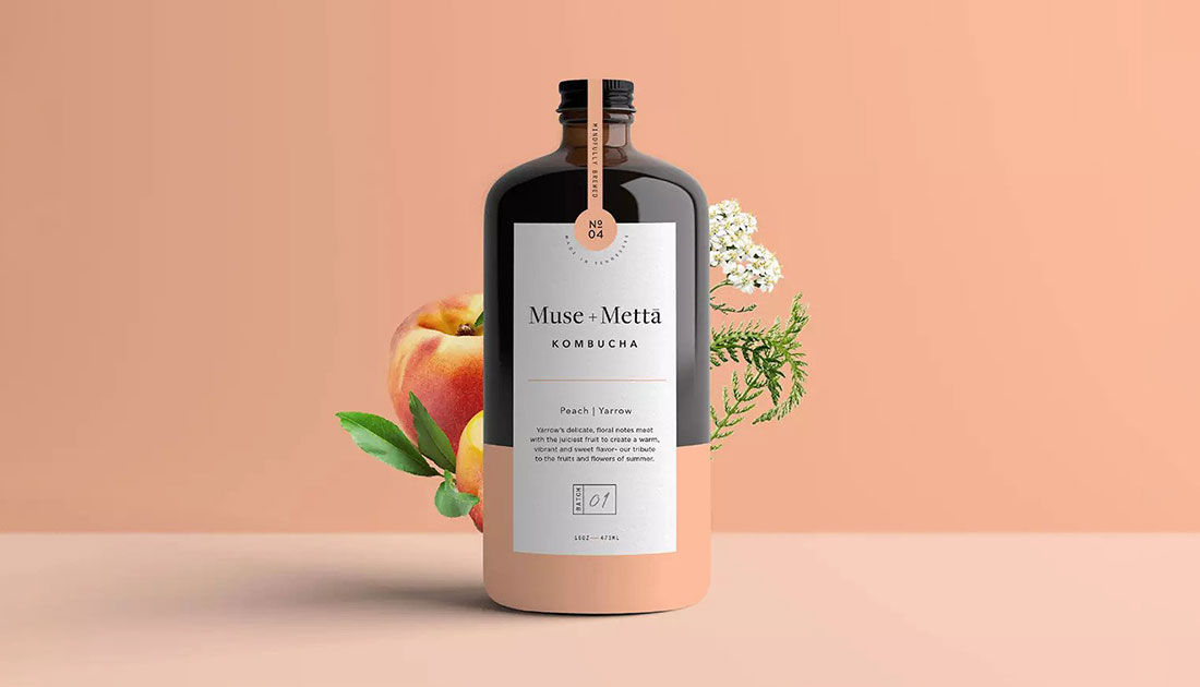
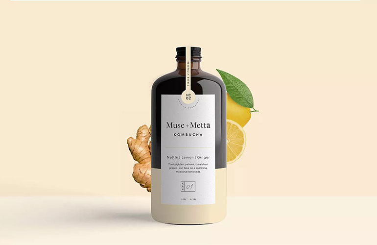
The labelling for this kombucha drink SCREAMS sophistication. It’s in a totally different category to Froosh and Innocent and is marketed more toward adults, which is very clear from the branding. The medicine-esque style of packaging is designed to reflect a culture of health, art, and possibility. While the colour of the labels for each flavour complements their ingredient profile. It’s subtle and simple, and we just love it!
Keep an eye out for our upcoming ‘Creative Club’ inspired pieces. We love to share the work that’s been shared with us!

Written by:
Phoebe Carden
Published: March 10, 2021