PRODUCT BRANDING, PHOTOGRAPHY AND COLLATERAL
Product branding for the high-end Kanso collection – to appeal to the architecture and design community, and lead Dorf into the future of Australian design.
Product branding for the high-end Kanso collection – to appeal to the architecture and design community, and lead Dorf into the future of Australian design.
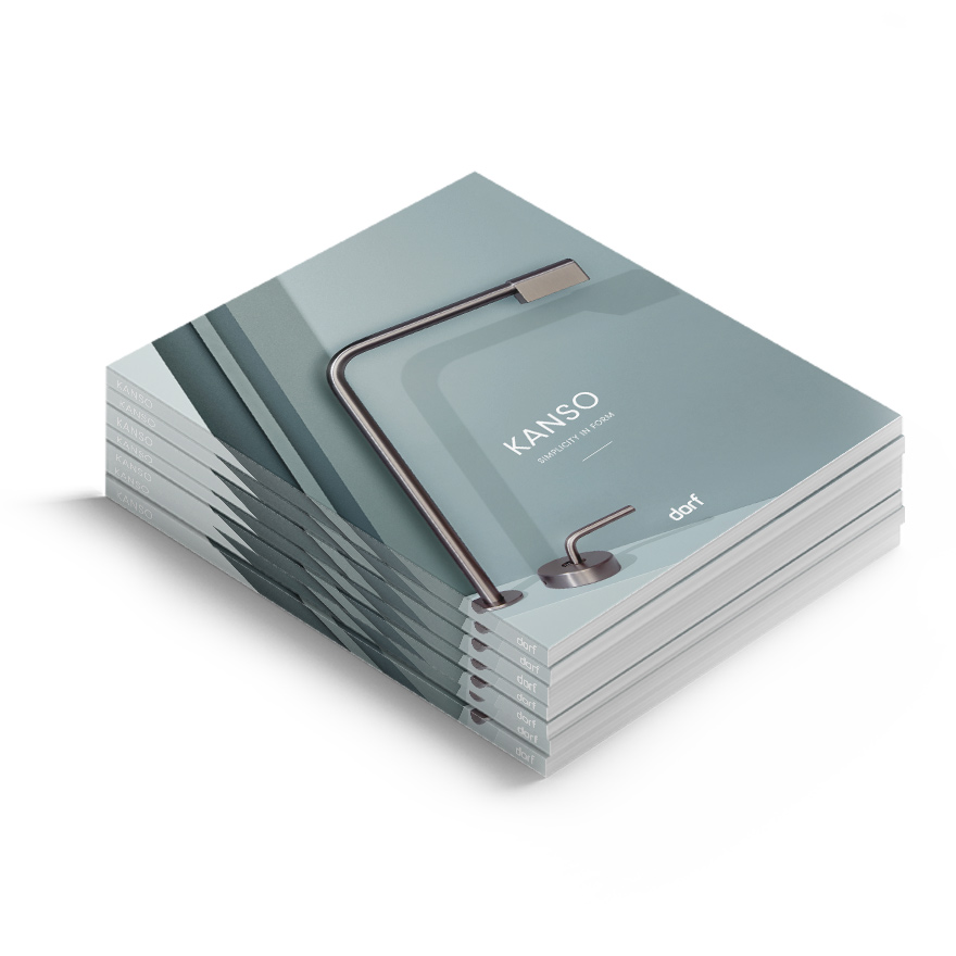
Kanso is the high-end collection of tapware and accessories, designed by iconic Australian tapware brand Dorf. Kanso has been crafted to appeal to the architecture and design community, and is leading Dorf into the future of Australian design. Kanso is a Japanese design principle meaning simplicity. A reinforcement of simple beauty. The satisfying gratification of simplicity and quietness is the foundation and inspiration behind the Kanso collection, designed by Vincent Ho. It is set to pave the way for Dorf’s brand repositioning into the future, and the look and feel needed to reflect the very essence of that — Beauty in Minimalism.
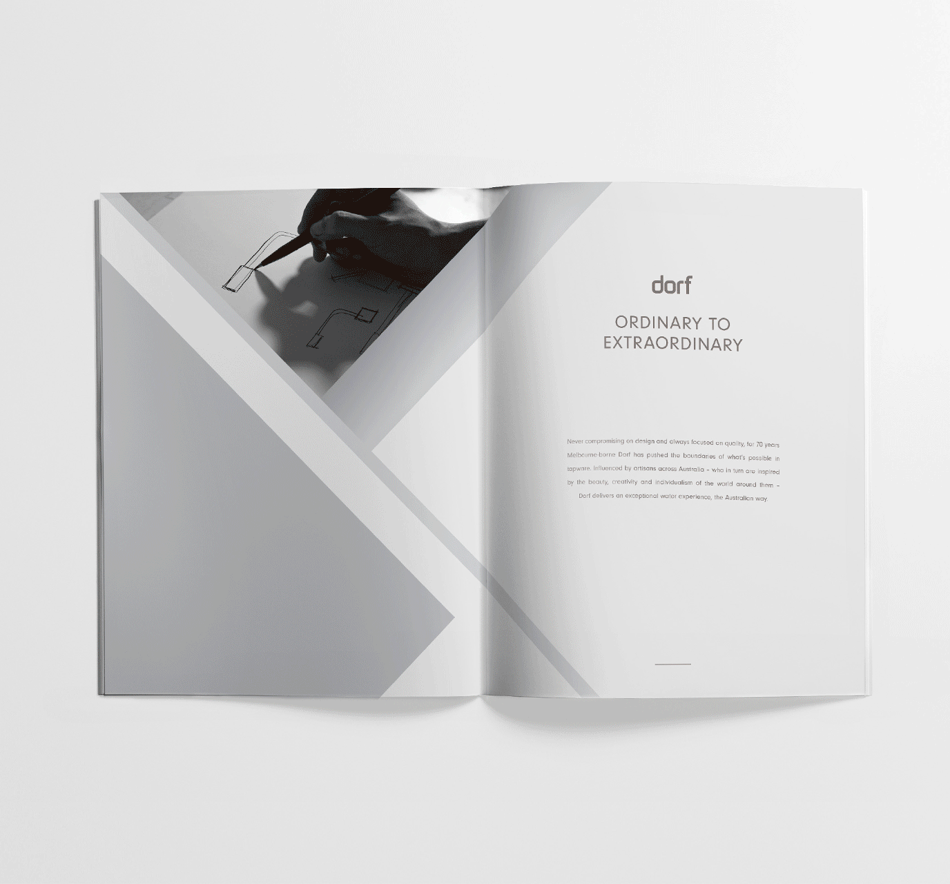
A simple, breath-taking presentation of the Kanso collection. Featuring their pieces in sharp, clean and almost zen-like imagery. Displaying the innocence of the uncomplicated. To achieve this look, we created 3-D set builds as part of our photoshoot. Within the brochure and on their micro-site, the angular edges of the set complement the smooth and rounded form of the Kanso product. The sets were built to showcase the Kanso products in all their architectural beauty. Nothing is there that does not need to be. And the copy is the same. Everything throughout the project removes the unnecessary, eliminates the superfluous and dismisses the gratuitous.

A look and feel that proudly reflects the simplicity in form. In every element of this project, from the words on the page, the simple sketch images, to the produced campaign and product shots, Kanso (and simplicity) are represented.

Brand identity
Brochure design
Copywriting
Photography
Website design
CREDITS
Photography by Guy Bailey