BRAND STRATEGY, BRAND IDENTITY AND PACKAGING
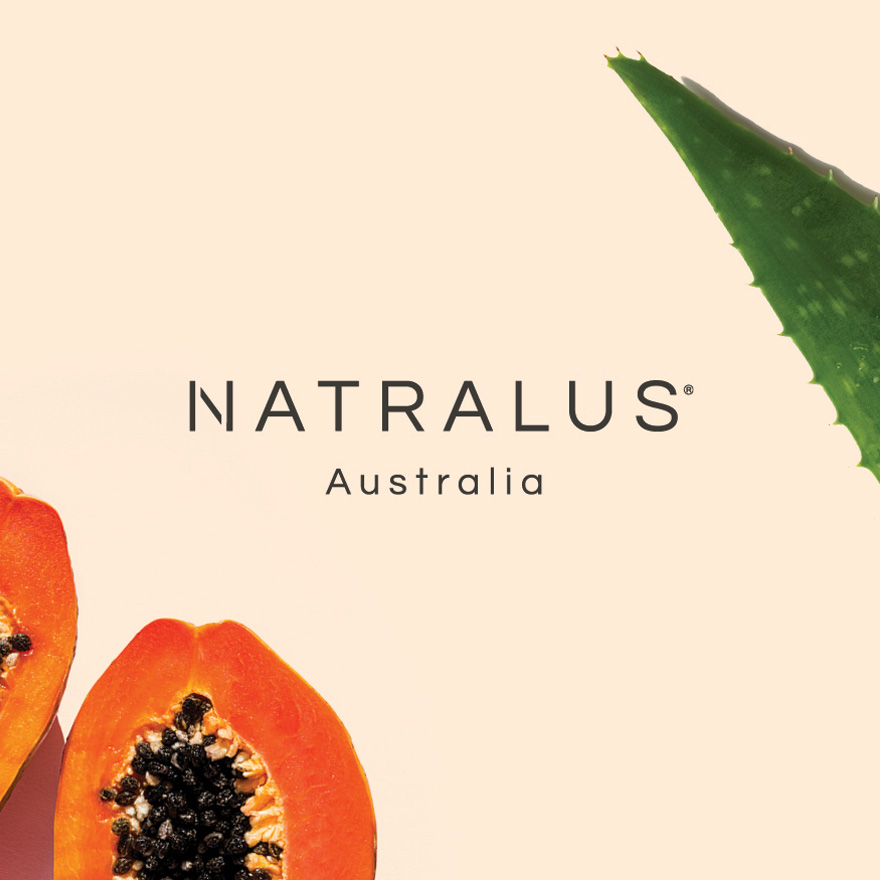
A rebrand for this Australian owned, all-natural skincare range — aimed at establishing brand consistency and clarifying their point of difference in a competitive market.
A rebrand for this Australian owned, all-natural skincare range — aimed at establishing brand consistency and clarifying their point of difference in a competitive market.
According to John Parker of the Economist, 2019 was declared ‘the year of the vegan’. And with that, an influx of ‘all-vegan’, ‘all-natural’ products flooded the beauty scene. This, in combination with the rise of ecommerce and social media platforms, meant that the market in which Natralus existed had become highly saturated. They needed a strong, consistent brand with a clear point of difference.
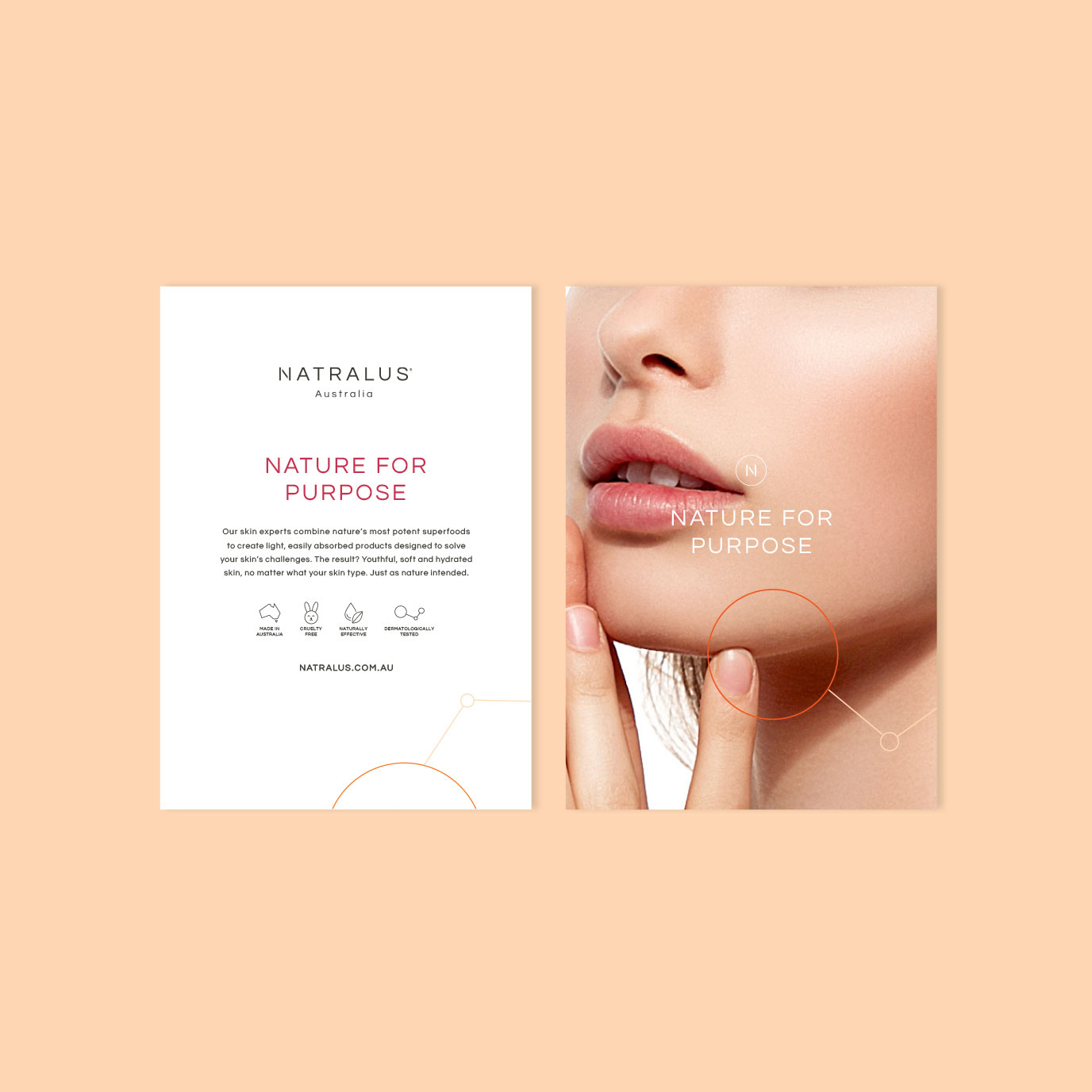
We identified their most unique elements to be, their Australian family ownership, superfood ingredients and their focus on treating specific skin issues. So we positioned them as a product with purpose. Not simply JUST vegan, or just organic — they are more than that. The rebrand focuses on the superfood ingredients in Natralus products. It brings this to life with illustrated molecules used as a graphic device, visually connecting science with nature. The packaging becomes an extension of this, using a solid circle, coloured in that product’s hero superfood ingredient, to draw attention and also create differentiation within the range.

A distinctly recognisable brand that highlights the simplicity of the superfood ingredient on the packaging. Their product is made with honesty and purpose, and the brand now reflects that through every touchpoint.

Brand Strategy
Brand Identity
Packaging Design