
Designing your brand for China
Designing specifically for any market and audience requires an understanding of the intricacies of that culture, and China is no different. There are so many details that need to be considered in terms of design sensibility, cultural differences and heritage in how the community likes to absorb information. And let’s not forget that China is a culturally diverse place, with many different regions with different dialects and cultural practices. China has 9 economic zones and 30 different markets. We view Europe as many different markets, so this is how we need to perceive China.
The first step when designing for China is to really understand the audience you are communicating with. Where are they located? What is their age? How do they access the information? What are their key cultural influences? When you understand this you can build a persona profile around the audience and work out the key nuances of design to consider, tailored for that audience.
COLOURS
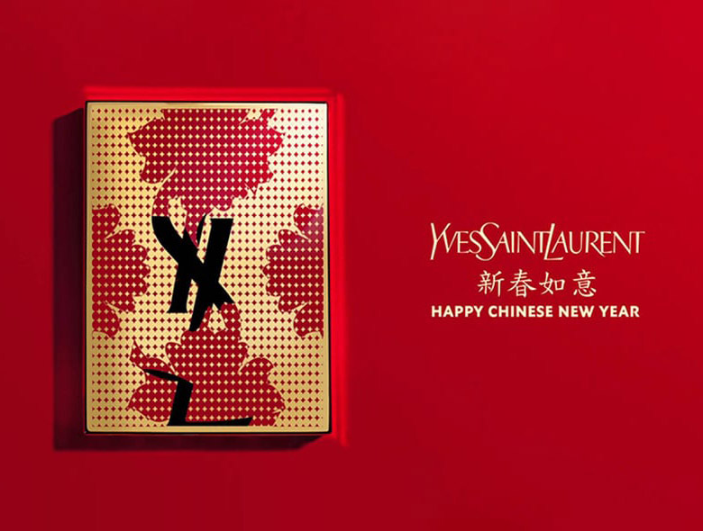
In China warm colours like yellow, orange and red represent prosperity, happiness and good energy. White, which in Western cultures represent purity, represents mourning in China. If you are appealing to a more traditional Chinese audience you would never design with black and white. This would mean death. If you are designing for a younger Chinese audience this thinking may not apply because Chinese design has been influenced somewhat by the West, so the old rules may not apply in their entirety.
SHAPES
Shapes need to be considered. Many Chinese words are derived from pictograms so shapes will have connotations. The practice of Feng Shui in Southern China and Hong Kong in particular, also affects how people will react to certain shapes. Round shapes represent a coming together, unity and harmony whereas sharp angles or triangles indicate a negative force and possibly even danger.
TRUST
As a generalisation, the Chinese people have a history of distrust for brands and as a result a Chinese audience needs lots of points of validation. Successful retail brand design for China will showcase a product in all sorts of scenarios – with certification documents, with ambassadors or influencers, from different viewpoints, with accessories. It’s almost as if you need to imagine that the customer needs to touch, feel and learn everything there is to know about the product within that one touchpoint. Communication needs to be instructional. And there needs to be context. Rather than showing a picture, such as an animal in isolation, you would need to show it in its environment, for example a deer would need to be displayed in a forest, not just placed on a brochure design or website on it’s own.
SPACE
Mind my space please! This concept doesn’t really exist in Chinese design. The more content, colour and bling the better. For a Western sensibility we think less is more, remove clutter. Your thinking needs to be reversed when designing for China.
At the end of the day, any design for any market is a visual representation of a message. So understanding how a particular audience will best receive that message is vital to the success of your brand in China, and elsewhere.

Written by:
Emma Scott
Published: September 6, 2016
Image source: YSL, Gucci