
Is it time to rebrand? Let us inspire you…
McDonalds, Instagram, Mastercard, Coca-Cola. What do these brands all have in common? Well, they’re not afraid to rethink their identity. At various stages, they’ve all taken the time to rethink and overhaul their brand. Because, if 2020 has taught us anything, it’s that times change quickly and unpredictably — and so too do people (aka: our customers).
As a branding agency with many rebrands under our belt, we’re always on the lookout for work to be inspired by. In our daily perusing, we’ve come across some great rebrands and campaign work we’d love to share with you…
AIRBNB
First up in the list of contenders, has to be the rebrand of Airbnb. Bursting into the scene back in 2013, the brand struggled to be heard in a crowded market (it’s a familiar story). Though their offering was unique, their brand and tone of voice wasn’t. Competitors were copying their messaging with similar campaigns and drowning out the true point of difference of Airbnb. CEO and Founder Brian Chesky was having none of that; he wanted people to know that his brand was categorically unique. So, he engaged in a rebrand.
A simple message
To set themselves apart, Airbnb worked with a team to develop the now famous brand message ‘Belong Anywhere’, along with their signature icon, the ‘Belo’. It’s a simple logo design that comes from a place of true meaning; it can be drawn and recognised by anyone, anywhere — representing exactly what Airbnb is about. Uniting people by revolutionising travel. Along with this, they’ve also put together a really great explainer video. Because people sometimes need a bit of extra help understanding what you’re all about.
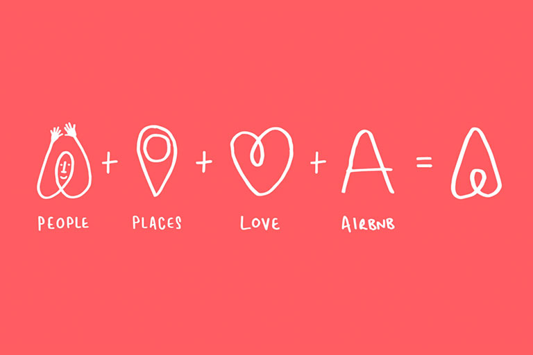
Image credit DesignStudio
THE PASSAGE
People connect with people. As brand specialists, we’re always trying to find ways to tell an authentic brand story that will resonate with a specific audience. So, London based charity, The Passage engaged with renown photographers, producers, filmmakers, stylists and makeup artists to help tell the story of homelessness in their city – and people listened.
A picture is worth a thousand words
For two years, The Passage team have converted their basement into a makeshift studio. And, photographic professionals have contributed to the project with one simple message, ‘give a photo, don’t take it’. By capturing the people behind the homeless faces, it humanises them. It creates intrigue behind their story, it gives them a human touch that potential charity contributors can connect with and presents a different perspective. You can’t just simply walk by these faces anymore, you have to notice them. By doing this, The Passage has created momentum and a brand that stands out from the rest. It now commands attention.
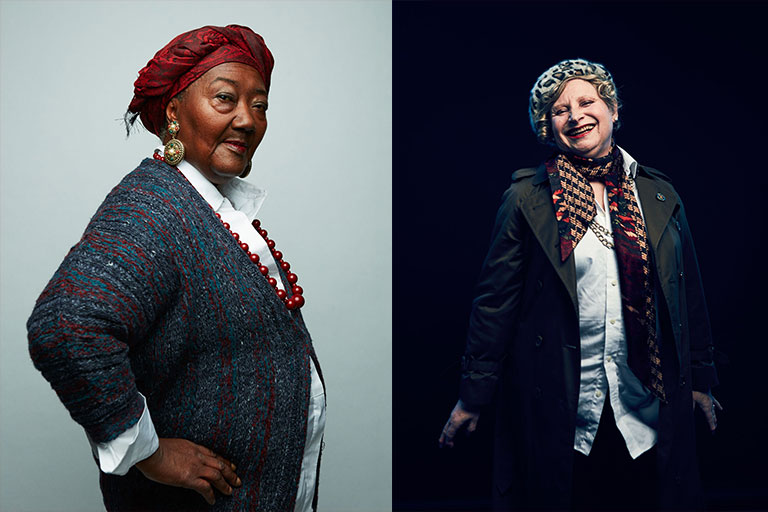
Image credit Creative Boom
IMPELO (CHARITY BRAND)
Formerly known as ‘Powys Dance’, this organisation was launched in Wales, as a way to bring the joy of dancing to all ages and social backgrounds. With sights set for growth and expansion, the charity brand called upon local agency Clout Branding, to help create a movement that would stand the test of time.
A new everything…
Clout completely rehauled this brand. Giving it a new name and an aesthetic that was rhythmic, bright and inviting — just like their offerings. This new look helps position the brand “beyond conventional perceptions of dance participation and towards one that empowers curiosity, ambition and lifelong learning”. And, we think it does the job. Just goes to show that you can’t be too restrictive when it comes to rebranding. Don’t be afraid to totally rethink everything (even your name). You’ll be surprised by how quickly people adapt to change, and how many MORE people connect with your new (strategically well thought out) branding.
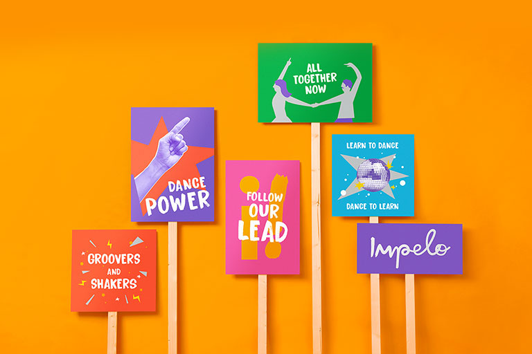
Image credit Creative Boom
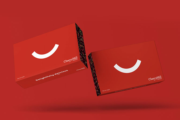
CHERRYHILL ORCHARDS
As is the case with so many family businesses we work alongside, CherryHill Orchards are always evolving in response to opportunities to expand their offerings. As such, the 75 year old brand needed a refresh. An identity and a voice that would be translatable across all new aspects of their business, both domestically and overseas.
Give us a smile
When CherryHill Orchards grew into the third generation of their founding family, the new kids on the block had some innovative ideas for the company. Along with selling the raw produce, they were going to make drinks and offer cherry picking experiences. And, with these new ideas came the need for a new identity.
We worked with their team to get to the core of what they wanted to achieve with their products, which turned out to be simple; joy. In line with this, we developed a logo that would just as simply reflect exactly that — inspired by a smile. We also worked on some cheeky messaging for the brand, and everyone seems to be enjoying it. Together we’re helping people get to know CherryHill Orchards ‘cherry, cherry delicious’ all-cherry everything(s).
Are you looking for help with your rebrand? Visit our showcase for our latest case studies or contact us.

Written by:
Phoebe Carden
Published: July 16, 2020