
Is your website doing your business justice?
In a world becoming increasingly digitised (and at unprecedented speeds – thanks COVID), a website is your shopfront. One that’s available 24/7, globally. It’s where people come to peer in through the window and decide if they like what they see enough to step inside. After much deliberation and ‘window shopping’, imagine that they’ve chosen your shop to explore further but once they get inside, everything’s in disarray. After all, nothing is more frustrating than not being able to intuitively navigate a shopping experience.
Each step and every minute a user spends on your website, needs to be a seamless experience. Where they’re constantly learning more about your brand, so that by the time they need to make a decision to commit to you or not — they know you already, they like you and they trust you.
SO, WHEN THINKING ABOUT YOUR WEBSITE – WHAT’S IMPORTANT?
If you’ve spent a lot of time and energy on developing your product or service, then it’s well worth ensuring your website reflects your offering effectively. The quality in what you do, how it differs to your competitors and most importantly, why your customers should care. When thinking about your website, these are what we believe to be the key factors for the best possible user experience.
BRING THE BRAND TO LIFE
Through every design and copy element, express your brand personality. Do your key messages and image choices align with your positioning? What about the colour palette, typography and graphic elements? Every single detail on your website should have been strategically thought about and have a purpose. And, what about the copy? Your website tone of voice is another key aspect of your identity. Not only should it be easy to follow but it should also further instill a sense of your personality. Then it needs to get technical. We suggest working with an SEO specialist to ensure the relevant keywords are sprinkled throughout your website, to help discoverability.
PROVIDE VALUE THROUGH A USER-CENTRIC EXPERIENCE
In the strategic planning phase of creating your website – and anytime you are making changes – you need to work from a user-centric perspective. What goals does your user have? How can you most add value? Are you using language that they relate to, especially in navigation? Too often we see websites filled with organisational perspectives and even structures – navigations that make total sense to an employee but aren’t really geared to the user at all.
STREAMLINE PATH TO PURCHASE
It seems obvious, but you’d be surprised how many websites do not have a clear and simple purchase pathway. With every moment spent trying to figure out how to get to purchase or contact a business for more information — that’s an opportunity for you to lose a client or customer. Ideally you want as few clicks as possible to get from the landing page, to the desired product, to the checkout stage. Then you need to consider a secure money transfer system. Where users can very easily pay for their goods in a way that feels safe and familiar to them. Some great third-party tools for this include, Stripe, PayPal or Square. Think about what sort of payment model you need, is your product subscription based? Is it simply a one-off transaction? And then assess the features of the various options out there, to find what will work best for your business.
PLAN YOUR KEY ‘CALLS TO ACTION’
It is critical to consider the key calls to action (CTAs) on your site. Given that only a fraction of people are actually ready to buy from you, what other actions are you encouraging them to take? Spending time and money getting new leads to your site and letting them leave without giving you their email address is a missed opportunity. On every page consider what is the primary action you want them to take, and how you can encourage that to happen. It’s important though that you are thinking of value creation here – what can you offer, that is compelling enough for the data exchange?
Now that we understand a little more about what makes a really great website, here are some examples of websites that have nailed certain aspects.
CARLSBERG
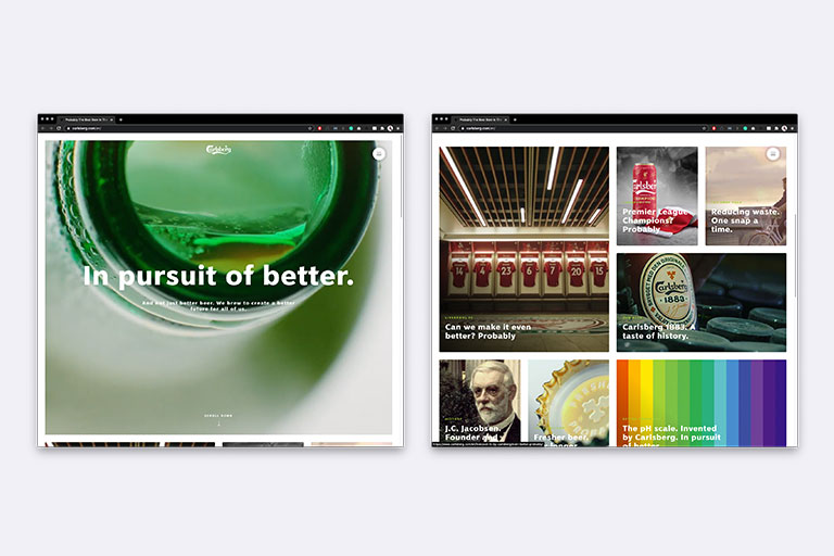
Most of us are already familiar with the brand, which helps set them up for success. Because of their established notoriety, they’ve been able to be really creative with their website’s user experience. Instead of simply an online shop, with product listings, the site guides the user through storytelling. Their minimalist design leads the customer through a curation of high quality videos, each telling a story about a certain kind of beer. Walking their audience through their product range cleverly and with intrigue. Their simple typography is juxtaposed with a bold colour palette, and is reflective of the confidence that the brand holds. The bold brand colours support their proud tone of voice, with the first copy you see as you land on the homepage being ‘in pursuit of better.’ At every possible moment, the brand’s personality is being showcased.
They’ve also spent a lot energy on creating content, so we know they truly care about their brand and really want to engage their audiences. Instead of a virtual Carlsberg shop, when you click through to their website — you get an exposé of Carlsberg’s personality. This creates a connection with the brand, beyond just the product it creates. When an audience FEELS something for your brand, they’re more likely to not only choose it over and over again but to also become an advocate for it. And, that’s what you want people to leave your website with; a thirst for both the product and the brand.
THE ICONIC
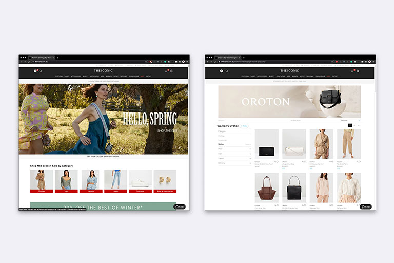
Launched in 2011, The Iconic has fast become the go-to place for online fashion shopping in Australia. Why? Because it’s filled with local and international brands, of all price points but MORE SO because the usability is so intuitive. Everything is categorised in a way that makes sense, it is easy to navigate through thousands of garments to find the right size, colour, style, brand — because they have filtering options on their search pages to do exactly that. Then, once you’ve got a nice shopping cart filled with exactly what you came there in search of… it’s a simple click through to the checkout page where you still have the option to remove any items you may have second guessed upon final review. They’ve got various payment options too, including the lay-by Afterpay option, plus any major credit card. Their purchase pathway leaves little room for frustration or confusion, just a few clicks, and you’re out the metaphorical door.
ETQ AMSTERDAM
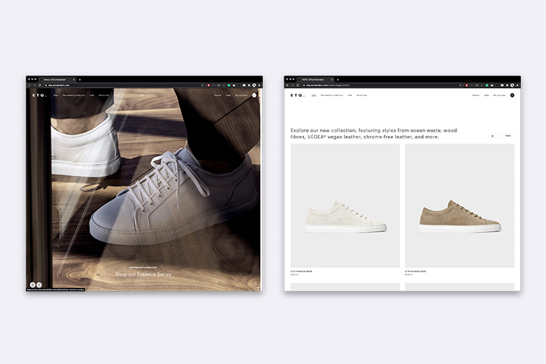
ETQ is an Amsterdam based shoe brand with one very clean and simple mission: to create a product that breathes luxury and design, but one that is also modest, minimalistic and affordable. And the brand goes all out in realising their minimalistic vision. The website is completely clutter-free, allowing the product to speak for itself (and take centre stage). The imagery used has a muted colour palette, and is uncomplicated. Their home page opens with a scrolling header that has seamlessly smooth transitions and as you navigate down the page. First up is a selection of informational content; their journey so far, how the shoes are made and shoe care. Which helps to tell customers that — front and centre — is their passion for the craftsmanship, and their emphasis on the handmade aspect of their product. It shows us that they care enough for their customers to know the back story, so if they care about that, then they care about the quality of the product as well. It humanises the brand.
Lastly, the whole site is extremely uniform in its aesthetic. It’s all clean, simple and modern. There isn’t a random image with dramatic colouring that doesn’t align with the rest of the content and the typography is just as simple as the copywriting choices made throughout. The brand name itself is minimalist too. Absolutely every choice ETQ has made in their virtual showcase, has been really well thought out and has been for a specific reason: to help establish their philosophy as a brand at every possible opportunity. There is no mistaking their persona, and mission at any point during the time it takes to peruse their website. And that, to us, is an example of a great digital brand experience.
FROM GOOD TO GREAT…
Your website should be a touchpoint that oozes your brand personality, values and mission. It should be easy to navigate, enticing even. It should draw potential and existing customers in, to want to learn more about your brand, explore products that perhaps they haven’t considered before and the purchase pathways should be completely seamless. With such easy access to a treasure trove of competing brands, it’s never been more important for yours to stand out.
It’s not enough to have a ‘good’ website that functions well. Yours should truly differentiate you from your competitors, tell your story and foster engagement.

Written by:
Phoebe Carden
Published: September 17, 2020