REBRAND
An unexpected new brand for investment platform Stockpot stands out in a world of corporate competitors.

An unexpected new brand for investment platform Stockpot stands out in a world of corporate competitors.

Stockspot is Australia’s first and largest online investment adviser. The platform builds a smart, personalised portfolio using proven investment strategies to grow people’s wealth using ETFs (exchange traded funds). This means great diversification, low fees, full transparency and steady and dependable growth. With trust in online investment platforms growing exponentially, Stockspot approached us to create a strong brand strategy and compelling visual look and feel that would set them up for the future.

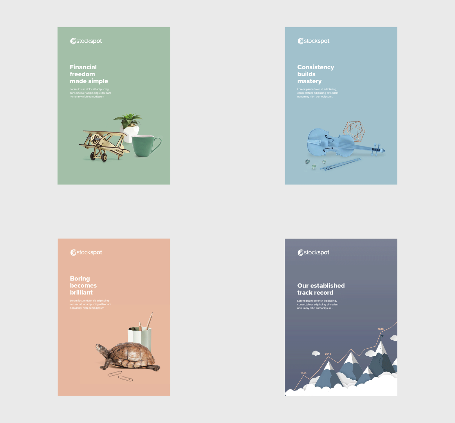
The first step was to create a clear brand strategy that would become the company’s blueprint for every decision moving forward. But what makes Stockspot different? The answer is honesty, transparency, and a complete commitment to never bullshitting their clients. Combine this with low fees and a CEO unafraid to call out the fat cats of the investment world, and there were plenty of USPs to create a compelling brand. These insights went on to shape every aspect of the strategy, as well as the tone of voice, copy, key messaging, and visuals. The visuals themselves are fun, playful, and unexpected – especially for a financial services company.

The new brand has been launched on Stockspot’s website (being an online investment platform, their website is their most important asset) as well as every other brand touchpoint from social media and EDMs to print. It stands out in the sea of corporate websites and builds on the trust and engagement Stockspot inspires in its customers across Australia.

Stakeholder workshop
Brand strategy
Tone of voice
Brand identity
Brand guidelines
Messaging architecture
Copywriting
